


Fall in Love with Muted Color Palettes
- Apr 1, 2017
- 2 min read
One of my favorite interior design trends that's easy for almost anyone to adopt is muted color palettes. It can add color and warmth to a room without being too bold and overwhelming. Its a safer option for anyone to play with colors. The use of these colors can add sophistication to any room.

Image Credit: mydecorator.com.au
Having a dusty aqua paint on the wall with artwork in subdued shades of pink and purple and a few jewel toned throw pillows adds life to a predominately white and grey living room.

Photo Credit: Kristina Lynne
Even though some of larger elements in this room are in pink and blue, the light dusty tones selected, along with the use of natural materials in white, cream, and grey keep the room feeling relaxingly cozy.

Photo Credit: Matthew Williams
In a room with a predominately muted color palette, adding one bold accent piece like the stool in this design, brings a touch of whimsy. The use of the velvet inspired wall treatment, the unique wall art installation, and the rattan chair bring visual texture to the room.

Photo Credit: Mama & Louis Instagram page
I'm obsessed with the look of this nursery. Even though the color palette is predominately made up of different shades of greys, (warm, cool, and french), the pale wooden furniture, sheep skin rug, striped rug, throw pillows, and toys bring so much visual interest to the room. It's the epitome of comfort and sophistication.
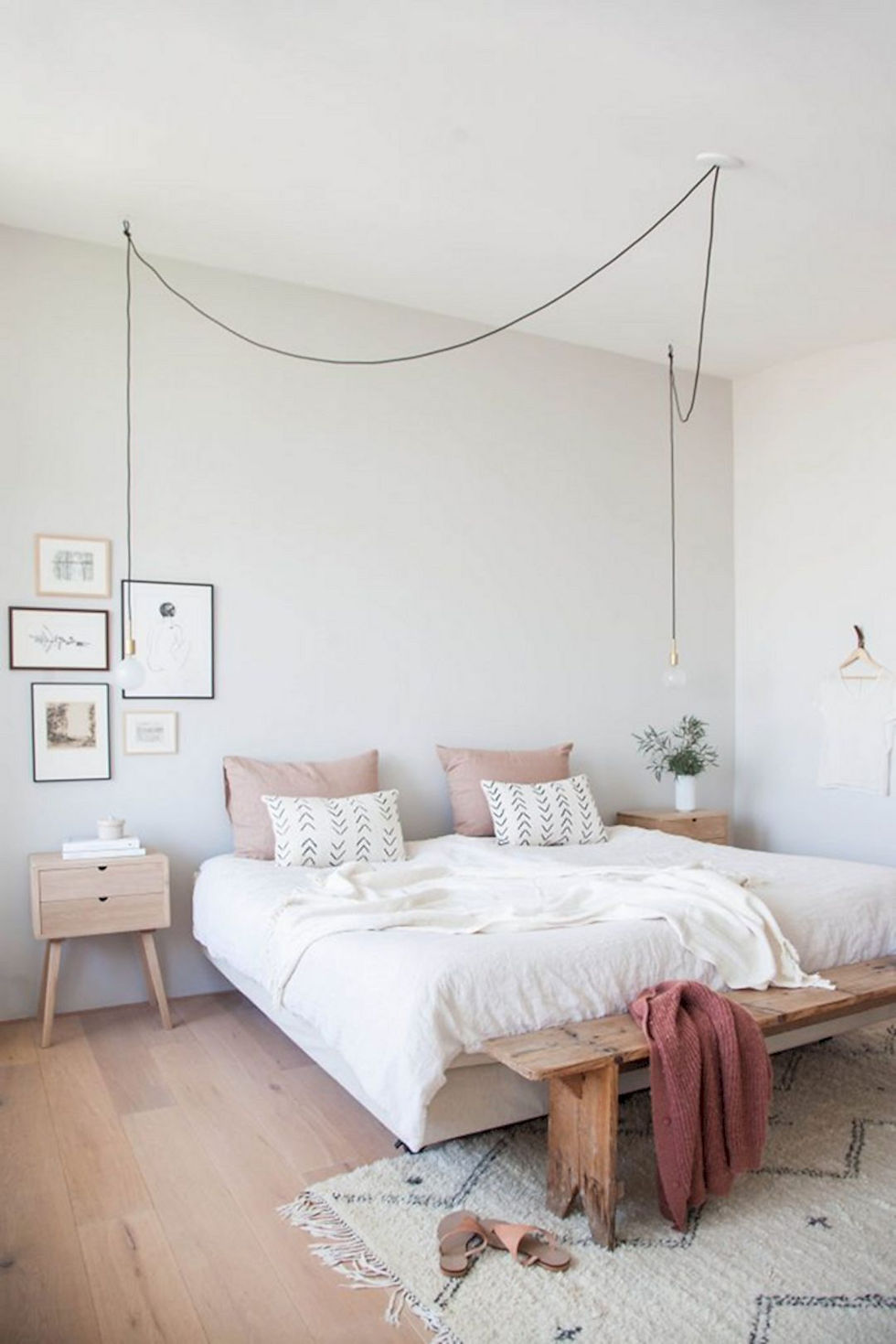
Photo Credit: Futurist Architecture
In this minimalistic room, visual interest was created with muted rose pillows, arrowhead chevron patterned pillows and rug, and both modern and rustic wood furniture. A unique lighting feature is draped over the bed to add drama.
Comments